Unrealized capital gains were a particularly important factor in the increase in net worth over the 2004–07 period. The share of total assets attributable to unrealized capital gains from real estate, businesses, stocks, or mutual funds rose 5.1 percentage points, to 35.8 percent in 2007. Although the level of debt owed by families rose noticeably, debt as a percentage of assets was little changed. The largest percentage change in debt was in borrowing for residential real estate other than a primary residence.From the 2007 Survey of Consumer Finances. Emphasis added.
With median and mean debt advancing faster than income, payments relative to income might be expected to increase substantially. In fact, total payments relative to total income barely increased, and the median of payments relative to income rose at a slower pace than it did between 2001 and 2004. Nonetheless, the share of families with high payments relative to their incomes increased notably.
Sunday, September 20, 2009
Why borrow? Rational Expectations Redux and why nominal prices matter
Wednesday, September 16, 2009
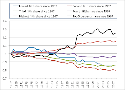
Inequality and Debt growth
Tuesday, September 15, 2009
For every invested dollar...
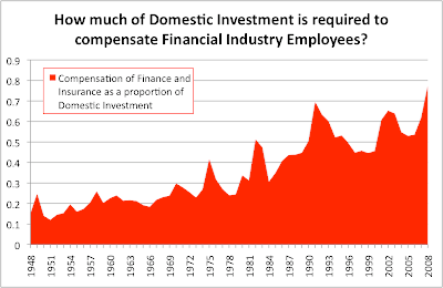 ... almost 80 cents goes to pay the salaries, bonuses, and other benefits of employees in the Financial Services and Insurance Industries.
 Monday, September 14, 2009
Whose government is it?
Sunday, September 13, 2009
The Price/Earnings Ceiling
earnings yield = dividend yield + growth rateto obtain:
P/E = 1/(dividend yield + growth rate)To put an upper bound on the P/E ratio, we want a lower bound on the yield + growth rate. Generally speaking, the total returns on capital (for equities, that would be growth rate and dividends) have been the GDP growth rate over the period. That is one of Kaldor's "stylized facts", which actually says that returns to capital as a fraction of GDP are the same over time, and that therefore the growth rate will be the same. Now, that doesn't need to be in equity, it could be in other forms of capital, but over time, it's hard for the equity returns to outgrow the total returns.
Saturday, September 12, 2009
Negative Re-Investment Rates
When the cost of equity capital is low, then the re-investment rate is high. This is dangerous for firms because the market is fickle, and periods of complacency quickly turn into panics, at which point the capital is re-priced, and now higher returns are demanded. Companies respond to this by trying to defend their dividends and thus end up liquidating a portion of their capital stock in the form of layoffs, shutdowns, and other asset sales.
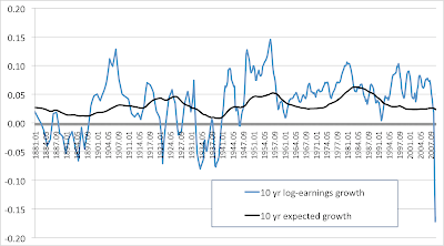
You can see a historic negative re-investment rate in this graph, corresponding to capital liquidation for the market as a whole.
Note that this is different from lowering the re-investment rate as you would expect in a regular recession. As long as the re-investment rate is positive, then productive capacity is still being increased, but at a lower rate. I.e., the growth of productive capacity is "slowing down" as opposed to shrinking.
Layoffs are always occuring as is hiring, but when the market as a whole has a negative re-investment rate, then productive capacity as a whole is decreasing. You can think of the difference as that between laying off a few workers versus closing a factory. It is harder for employment in the latter case to recover because it requires a greater investment commitment on the part of management as they emerge from the recession. But this is exactly when management is still skittish. This is not to say that employment can't or wont recover -- but the hurdle will be higher.
Moreover, the graph suggests that the current market downturn is fundamentally different from the crashes and recessions in earlier periods. You have to go back to Great Depression, the 1921 recession, or the Long Depression (1893-1898) to find such periods of negative re-investment, and all of those periods were dwarfed by the negative re-investment that we see today. Note that all three of the historical precedents were deflationary recessions.
Valuing Equities without Discounting
In particular, if r = 1, then all earnings are re-invested, and if r is negative, then the firm is selling off capital, since it cannot meet the owners' required rate of return.
g = rE/C = r*(E/C) = r*(earnings yield)
dividend yield = ((1-r)/r)*g= (1/r-1)*g
earnings yield = g/r
earnings yield – dividend_yield = g
earnings yield = dividend yield + g ("dividend capitalization model")
- g = growth rate of earnings, dividends, market-cap
- r = re-investment ratio
Wednesday, September 9, 2009
Chart of the Day: Earnings Arbitrage in Financial Yields/Private Sector Yields
See how these returns began to decline during the debt-deflation and climbed during the debt-inflation starting in the 1980s, but there is at least evidence for not a lot of variation for the sum of earnings for both corporate and non-corporate businesses.
Monday, September 7, 2009
Gloomy Chart of the Day
It seems that you can only pay down one sector's debt to GDP at the expense of increasing another's -- that is, except for mass defaults. This chart omits a few sectors, such as farm debt, and nonfarm non-corporate business debt, but the sum of non-financial private sector debt/GDP + the sum of government debt/GDP has always been growing, too -- ever since "Fed Independence Day", when the U.S. stopped forcing the Fed to monetize whenever treasury yields rose above a certain level.
Sunday, September 6, 2009
A Tale of Nine Cities: Rents 1930-2007
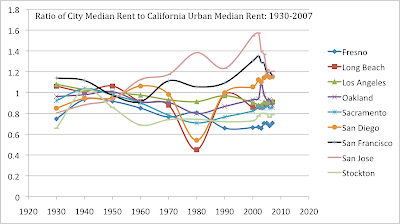
The following continues the historical exploration of relative house prices by looking at the ratio of median rents paid in nine selected California cities to the ratio of median rents throughout the state. The state ratio takes into account urban areas only (rural median rents are lower). All data comes from the census.
Saturday, September 5, 2009
Rare voice of reason
Revolutions create a curious inversion of perception. In ordinary times, people who do no more than describe the world around them are seen as pragmatists, while those who imagine fabulous alternative futures are viewed as radicals. The last couple of decades haven’t been ordinary, however. Inside thepapersnation, the pragmatists were the ones simply looking out the window and noticing that the real world was increasingly resembling the unthinkable scenario. These people were treated as if they were barking mad. Meanwhile the people spinning visions ofpopular walled gardens and enthusiastic micropayment adoptionschemes to repackage bad assets into good assets, visions unsupported by reality, were regarded not as charlatans but saviors.
Friday, September 4, 2009
Another Look at Long Run Equity Returns
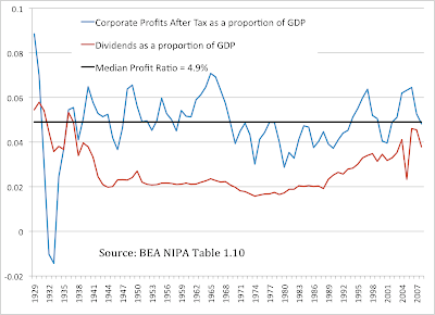
Over this time period, the ratio of profits available to corporate business was around 5% of the economy. There is what seems to be obvious mean-reversion. More interesting is the stability of the dividend payouts except for the two credit bubble periods, one deflating since 1929, and one inflating from the 1980s until just recently. Companies are loathe to increase dividends without appropriate future coverage, and so the dividend payout/GNI contains meaningful information about the estimates of management for sustainable future returns, and is much less volatile than the equity multiple. A dividend payout of 2% of GNI was remarkably stable between the two credit bubbles.
Early data about market capitalization is hard to find, but we can look at total market capitalization in the second half of the 20th century. The following chart, from the Federal Reserve Flow of Funds, shows total market capitalization of U.S. corporations divided by the Gross National Income, reported on a quarterly basis. You can also see the total dividend payouts divided by the total market cap (i.e. the dividend yield of the entire market).

By this historical metric, the present market is not cheap. It would need to fall by 50% in order to reach the post-war lows from 1974-1984 -- and that is a decade long period! We can also see the same shape that is a common refrain in most of the graphs: the 20 year run-up culminating to the twin-peak blow off of 2000 and 2007 that at least seem to suggest the beginning of a downtrend. From this long-run perspective, the period from 2003-2007 seems like an enormous bear market rally.
Don't let anyone fool you into believing that the total equity value of U.S. corporations can consistently outpace the size of the economy. As can be seen from the historical record, periods of multiple expansion for both corporate profits/GNI as well as market-cap/GNI tend to mean-revert, even though they can last long enough to convince the public that "this time it's different". Those who cut their teeth in the period from 1980-2000 did not experience a representative time in the history of U.S. equity values.
Thursday, September 3, 2009
In Search Of The California "Desirability Premium"
But in more desirable areas, are owners willing to pay a greater proportion of their income on housing? Let's take a look:
FYI, owners are willing to devote a median value of 31% of their household income for mortgage costs in San Francisco, 35% in Oakland, 34% in Los Angeles, 29% in Vacaville, 44% in Beverly Hills, and 40% in Lennox. In general, the graph suggests a slight downtrend, in that owners in wealthier areas are willing to devote a slightly smaller share of their income for mortgage costs, however the R^2 value does not give a lot of confidence.
In this case, there is an extremely weak correlation that suggests that the greater the inequality, the less owners are willing to pay, proportionately -- but the relationship is weak.
So it turns out that the "desirability premium" is very hard to find when looking at data. Generally speaking, areas with higher household incomes command higher house prices, but not as a percentage of income. There is evidence that as incomes increase, people are willing to spend less, proportionate to their income, on monthly mortgage costs.
Wednesday, September 2, 2009
A Tale of Six Cities: 1930-2007
The chart shows the ratio of the median house price to the median annual rent paid for six california cities form 1930-2007, using census data together with the American Community Survey. Rents are calculated as median monthly contract rent x12.
You can see both the wage compression period, together with a secular period of expanding multiples (and declining yields). This is due to effects such as Proposition 13, the mortgage interest deduction, longer repayment periods and the introduction of additional subsidies. Don't forget the boom/bust pattern common to California, particularly coastal California, as well as the parabolic multiple increase starting with the 2000 census. The time series ends in 2007, but we can watch it collapse as subsequent surveys are released.
A Tale of Seven Cities: 1930-2007
Note the rent uptick during the dot-com period followed by collapse for San Francisco and San Jose, although Oakland had a very brief mini-spike as well. Also note the effects of wage compression during the post war period, as rents crowded around 1 and then diverged. Also note the increasing volatility of these ratios, as the higher income cities tend to be more volatile after the period of wage compression.
Can you guess when rent control was instituted in some of these cities?
Long Run San Francisco House Prices: 1930-2007
The San Francisco Income Bubble
There is a 2 year lag for the local data, but I don't think this bump is durable. Let's see what that graph looks like once the 2009 numbers come out.
Tuesday, September 1, 2009
Goosing Equity Returns via Dividend Re-investment?
Here is the algorithm:
- Start with a notional account. E.g. $1 in the DJIA index, invested in 1900
- Over each time period, if the index changes by X%, assume that your equity does, too.
- Over each time period, if a dividend payout of D% is given, add back that amount to the equity value, via a "dividend re-investment model".
- Watch your holdings increase at a compound annual growth rate in excess of the growth rate of the index.
- Peddle books, or drive a pension fund into the ground.
First, some background.
The market cap of a firm reflects investors' beliefs about the present value of all future earnings of that firm. Some of those earnings are retained -- re-invested by the management -- and the remainder are classified as "surplus profits" and are distributed as dividends.
The decision to make a distribution amounts to a belief by the firm that it cannot re-invest those profits while maintaining the expected growth rate -- so it distributes those dividends to investors.
On the ex-dividend date, the equity value falls by the distribution amount -- since the "value" of the company is now less (it has one less future earning!), and on the distribution date, the owners receive a cash payment.
The total value of the owners' stake has not changed, they just have some of that value in the form of cash that they control as opposed to having that cash locked up in their equity accounts. For this reason, you do need to include cash-holdings in any calculation of total return. A total return calculation should include all holdings.
In the real world, some of those dividends are re-invested in equities, and to the degree that they are, this drives up the equity value of target investments as investors compete to bid up the share price of the target firms. So the net effect is to lower the cost of capital for some firms while raising it for others as investors continually engage in a process of valuation.
This process supposedly results in no company being without sufficient capital to give investors the return they demand. So for the market as a whole, the dividends flowing out of the entire market are surplus profits for all the firms in the market. In other words, over time, investors believe that no company can increase its capital base while maintaining the expected yield; otherwise they would bid up the share price and drive down yield.
Therefore when looking at a historical time series of prices, whatever equity re-investments actually occurred, they are already recorded in the time series. It is double-counting to include the observed market cap increases of those firms that are the targets of investment, and to not count the market cap declines of firms that made distributions. Moreover, any dividends thrown out by the entire index should be assumed to be surplus capital for the index as a whole. This means, if those dividends were re-invested, they would come at the expense of a fall in yield.
Equity prices are everywhere and always subject to a process of valuation, and this means that you should not always re-invest. You cannot always throw surplus capital back into the hands of management and maintain the same rate of return. You cannot always bid the price of equity up and expect profits to rise. At some point, additional investment results in stock price bubbles followed by crashes, because the earnings growth rate is constrained by GDP growth rates, and you cannot goose GDP sustainably by bidding up the price of equity.
At some point, you are better off buying a bond or even holding the dividend in a cash-equivalent, rather than overpaying for low yield.
Now, the specific flaw in the algorithm: the mistake is in Step 3.
The book-peddler is inserting a fake transaction into the historical time series, by assuming that you will be able to increase your holdings of the company without bidding up the price. All these backwards looking "what-if" scenarios suffer from the same flaw, which is that they are minority strategies. If enough people followed these strategies, the price would shoot up, the dividend yield would collapse, and the strategy would underperform the historical time series. Any time you see someone peddling a "total return" strategy that is greater than long-run GDP growth (which was 6%, in nominal terms, over the last 100 years), then you are being sold snake oil.
How much does the fake transaction that allows for purchases of shares without bidding up the share price distort the historical time series? One way to measure this is that if the "average" investor's equity holding could grow, by any series of transactions at the rate of the dividend payout + the observed rate of equity growth, then the total equity value of the whole market would also grow faster than the observed rate (by the same amount). Moreover, the synthetic model assumes that the dividend yield on this larger equity value would be the historical yield. This means that there would be a divergence between the observed profits and the profits as predicted in the model:
Given that aggregate earnings grow at the rate of GDP growth, a strategy that claims to outperform GDP growth by 3%, will after 100 years predict
- dividend payments 19 times the observed payments
- market caps 19 times greater than the observed market caps
- "total returns" 19 times greater than the total returns of the average investor.
But, what about our investor, who suffered an equity loss of $1 and has $1 in his cash account? Can't we add $1 to his total returns? Absolutely! If by "total returns" you mean a real-time mark-to-market of all the holdings of a particular investor, then this is valid (and necessary) to gauge performance. And you should add total dividends paid to the cash account of any historical time-series. The only flaw is when you insert fake transactions into the historical time series, by assuming re-investment without assuming that this will change the historical prices -- i.e. assume it is possible to buy or sell shares without altering the historical prices. That is fundamentally a minority strategy, and will not succeed if engaged by the public at large, or even by a sizeable minority of the public. Certainly it will fail if large players such as pension funds use the strategy.
So, then, what are the expected "total returns" of the market?
- A first order long run estimate is the long run GDP growth estimate. This has been the observed returns over 50 year time periods, at least for equities.
- John Hussman authored an analysis that takes the "gap" between current stock values and the long run GDP growth rate, taken to be 6%, with the assumption that mean-reversion will occur in the longer run. There is evidence for this over 10 year time periods
About

Subscribe Now: Feed Icon
Blog Archive
-
▼
2009
(36)
-
▼
September
(19)
- Why borrow? Rational Expectations Redux and why no...
- Inequality and Debt growth
- For every invested dollar...
- Whose government is it?
- The Price/Earnings Ceiling
- Negative Re-Investment Rates
- Valuing Equities without Discounting
- Chart of the Day: Earnings Arbitrage in Financial ...
- Gloomy Chart of the Day
- A Tale of Nine Cities: Rents 1930-2007
- Rare voice of reason
- Another Look at Long Run Equity Returns
- In Search Of The California "Desirability Premium"
- Visualizing Housing Subsidies
- A Tale of Six Cities: 1930-2007
- A Tale of Seven Cities: 1930-2007
- Long Run San Francisco House Prices: 1930-2007
- The San Francisco Income Bubble
- Goosing Equity Returns via Dividend Re-investment?
-
▼
September
(19)
blogorama
Labels
- California (4)
- Charts (3)
- Economics (16)
- Housing Economics (8)
- Investing (4)
- Investing Myths (1)
- San Francisco (7)


